
Design
True Ink
A window holding twelve agent sessions has one job before it has any others: to say which of them needs a person. That constraint decided the whole palette, and it decided it in one sentence — hue belongs to state.
1 · Hue belongs to state, so the accent is light
Green, amber and red mean working, waiting on you, and broken. They are
never spent on decoration, which leaves the interface with no colour to
be branded in — so the accent became light itself.
--accent resolves to the same value as --fg.
That is not a collision waiting to be fixed. It has one visible consequence worth knowing before someone files it as a bug: a primary button is the ground and the ink inverted, so it reads as a switch that has been thrown rather than as a coloured call to action. For the actions this app has — start, merge, close — that is the right reading.
--st-working #7bd77f working --st-waiting #efc845 waiting on you --st-error #fb817a stopped on an error 2 · Elevation is lightness, not shadow
--bg-void resolves to #040405. Four units of
brightness remain below it and no amount of black can reach them — so on
this ground a cast shadow is a declaration that does nothing. An earlier
pass spent a 30px drop shadow at 75% black on every surface and got a
flat interface whose stylesheet claimed otherwise.
The step from stage to raised surface does that work instead: 0.097 in L, twice what the previous ladder spent. The edge is paid for by a lit hairline along the top at 7.5% white, plus a two-pixel contact shadow — the one part of a shadow that still reads on near-black, because it is the line where an object meets what it lies on.
--bg-void #040405 The stage. Everything floats on this. --bg-chrome #0b0c0d The top bar, which gives the window a top edge. --bg-island #161719 A raised content surface. --bg-inset #28282a A field or control sunk into an island.
The three names carry the elevation itself, and the ladder is spaced by
what has to be distinguishable rather than by even steps:
--bg-inset sits 0.073 above --bg-island
because a field is recognised by its fill, not by its border.
--fg #f6f7f9 Text, and the accent — they are the same value. --fg-mid #b9babd Secondary text. --fg-dim #9a9c9f Captions and metadata. --line #2d2e30 A hairline between surfaces. 3 · The cast is cool, and almost absent
OKLch hue 265 at chroma 0.003 — a near-black stage with a trace of cool
in it. The pass before it used a warm graphite at hue ~70, which is a
warm grey in theory and reads as brown in practice: beside
--st-working's green, a deck of twelve tiles picked up an
earthy tint. A palette chosen to protect one signal had spent a cast
competing with it.
Five directions — True Ink, Warm Ember, Graphite, Blue Steel, Deep Petrol — were authored in OKLch, resolved to sRGB, measured and drawn on identical fragments before one was picked. The other four are still in the generator, so reversing this decision means re-running a script rather than reopening an argument.
4 · The terminal does not follow the palette
A terminal is a window onto another program. Those six ANSI hues are
Claude Code's, not the app's, and overriding them would be the app
lying about somebody else's output. What the app owns is the
frame: the background, the foreground, the cursor — and
brightBlack, which is the terminal's equivalent of
--fg-dim and is most of what Claude Code's secondary output
is drawn in.
The caret is the foreground rather than the accent. That stopped being a choice the moment the accent became light itself: of two names for the same value, only one is true of a terminal cursor.
Every colour pair is measured, and the test fails the build
npm run contrast reads the theme rather than quoting it,
walks every pair the design claims, and fails if one falls under its
threshold. Three pairs deliberately do fall under, and the script
documents which three and why — a documented exception is a decision, an
undocumented one is a bug nobody has found yet.
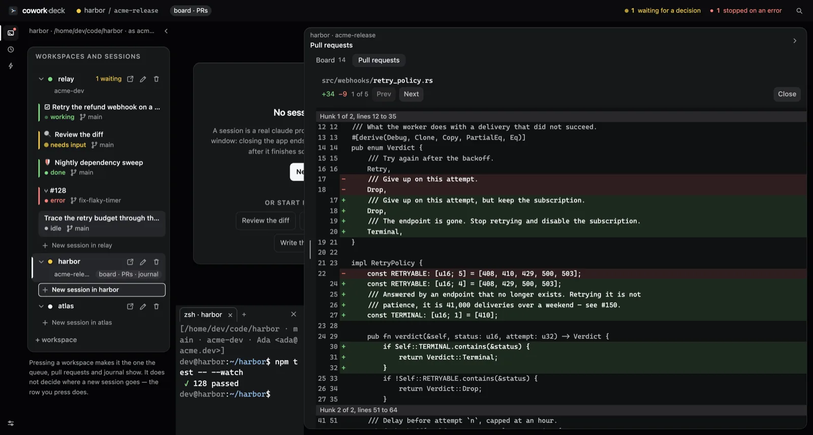
The diff is where this pays off most visibly. Colour is the third
channel there, never the channel: the added and removed bands measure
roughly 1.0 against each other, so the literal + and
− in their own column do the work. The diff reads for
someone who cannot tell the two bands apart, which is a larger number of
people than most diff views assume.
The reasoning, in full
The complete record — the OKLch source, the generator, the five directions on identical fragments, the mockups, the mapping table between the mockups' token names and the app's, and the measurements — is in the repository under docs/design/true-ink. The mockups need no build step; open them in a browser.
This site uses the same tokens, copied rather than imported: a landing page that had drifted a shade from the product it shows would be worse than one that never matched.